i recently found out that all the images on my blog weren't visible, because i posted them to a file share forum discussion, and it appears you have to register and log in to see any images.
so if you'd been through my blogs before (all 10 of you), welcome back to "..." V 2.0, now with working images.
Friday, September 21, 2007
dann mathews: tattoo designer.
my boss asked me to design a tattoo for him so he could get inked before he heads off on vacation.
his wife (another boss of mine) had inked a beautiful design commemorating her succesfully having cancer removed. and she is so in love with her tattoo that she talked her husband into it.
my boss is a knights templar free mason (i'm sure i got some of that wrong, i know more about the springfield stonecutter's than i do of the masonic societies)
so he asked me to mix in a few elements: the double barred cross, a sword, some icons and the wings.
so i put this together, mashing them all together:
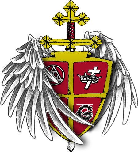
(that bar above the "G" icon appeared during file compression... i was too lazy to get the source file from work to fix it)
i'm pleased with it, the only things i didn't draw by hand were the icons on the crest (as they're too small to worry about the detail in the time crunch i was under) and the wings. the wings are from an existing tattoo design.
he's getting this on his bicep, it should look cool. he just wanted something more than the compas and all seeing eye that alot of other masons get inked in.
it was an interesting diversion for a day where a client called my work "crap".
his wife (another boss of mine) had inked a beautiful design commemorating her succesfully having cancer removed. and she is so in love with her tattoo that she talked her husband into it.
my boss is a knights templar free mason (i'm sure i got some of that wrong, i know more about the springfield stonecutter's than i do of the masonic societies)
so he asked me to mix in a few elements: the double barred cross, a sword, some icons and the wings.
so i put this together, mashing them all together:
(that bar above the "G" icon appeared during file compression... i was too lazy to get the source file from work to fix it)
i'm pleased with it, the only things i didn't draw by hand were the icons on the crest (as they're too small to worry about the detail in the time crunch i was under) and the wings. the wings are from an existing tattoo design.
he's getting this on his bicep, it should look cool. he just wanted something more than the compas and all seeing eye that alot of other masons get inked in.
it was an interesting diversion for a day where a client called my work "crap".
i'm not sassy enough.
my creative director and me were put to the task of making logos for a diner.
we were given an outline of them being sassy and known as the "hidden jewel of duluth", so we set out.
i had come up with these.
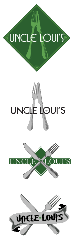
i obviously was rather fond of them, but none of them were picked.
after meeting them, it is obvious why they gravitated towards the one that the did, and had i met them prior to creating the logos, i would have changed the design knowing their general attitude.
i got a new layer of thick skin as they placed my 3 mouted foamcore boards aside and said out loud "these 3 are crap" and then backpeddaled a bit and explained that they are too contemporary, which i agree entirely. i held back a tiny wince at the word "crap" though.
what can i say, i'm not sassy enough.
(all logos shown are owned by carlson media inc., my employer)
we were given an outline of them being sassy and known as the "hidden jewel of duluth", so we set out.
i had come up with these.
i obviously was rather fond of them, but none of them were picked.
after meeting them, it is obvious why they gravitated towards the one that the did, and had i met them prior to creating the logos, i would have changed the design knowing their general attitude.
i got a new layer of thick skin as they placed my 3 mouted foamcore boards aside and said out loud "these 3 are crap" and then backpeddaled a bit and explained that they are too contemporary, which i agree entirely. i held back a tiny wince at the word "crap" though.
what can i say, i'm not sassy enough.
(all logos shown are owned by carlson media inc., my employer)
Thursday, September 20, 2007
righteous robo roundup.
as a huge transformers fan, i've always been keen on robots of all sorts.
i decided to run through some vector designs i'd made over the past 2.5 years and was actually suprised at their numbers.
here they all are, titles and explanations after the images. and if you like any of these, they are all for sale currently.
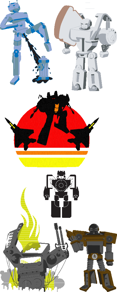
#1 a radom sketch of a robot "peeing" on a fire hydrant like a dog. this was done prior to the transformer movie's polarizing scene of bumblebee doing the same thing. this was one of the first pieces of vector art that i completed from sketch to screen. i created it as a possible threadless design; but i blogged about it as a work in progress and it wasn't well recieved so i shelved it.
#2 this guy is my favorite and he made it into my personal portfolio. toastor! he made his rounds through threadless

i was very pleased with the execution, especially since this was the first sketch to screen vector i shared with the masses. this little guy also has a backstory:
"TOASTOR
'I will butter the charred chassis of my enemies... then sprinkle fresh cinnamon on their remains!'
Toastor is the maniacal leader of the evil Appliance Defiance squad. In battle, his strategies are unmatched, leaving many of the Utensil Defense soldiers sent to the dishwasher of doom. After burning one too many slices of toast, society tossed him aside. After emerging from an alleyway trashcan, he amassed an army of the disposed, and ever since, the "Appliance Defiance" has been taking over the world... one kitchen at a time."
#3 here's a design titled "seekers" showcasing the 3 generation one transformers jets making up the team by the same name. i wanted to place their sihouettes against a very vintage looking sun design. never did anything else with this one.
#4 a transforming ipod. modeled after soundwave, one of the more popular generation one transformers that changed into a tape deck, i thought this was a novel idea... but wait a few years, and it exists. as big a fan of transformers as i am, i had to hold back on an overly expensive mp3 player, when i already have an ipod stuffed with 6,000+ songs
#5 "rock monster" this guy also ran his threadless course:

just an abstract idea i had that i wanted to see come to life. this was the first time i played with swatches (for the smoke and fire) and got the swawtches to work well.
#6 and lastly, "back burner" another soldier in the appliance defiance. i had fun making him, but after toastor scored so low on threadless, i decided against adding him to the competition. he has his own story as well:
"Back Burner
The once proud stovetop oven cooked thousands of family meals. After his owner's house sold to a young couple, they opted for a "less drab" color scheme in the house and tossed him to the back curb. It was there that Back Burner met Toastor and joined the ranks of the Appliance Defiance. The muscle of the group, he remains quiet and stoic, and loyal to Toastor's cause. He has been known to overkill "innovative" appliance's, like refrigerators with LCD screens, during raids; a rage issue Toastor secretly hopes he never has to reign in."
so there is my vector robot collection (paling in comparison to my plastic robot army, taking up real estate in 9 large tubs in my closet).
again, these are all for sale, if anyone loves robots as much as i do, let me know.
i decided to run through some vector designs i'd made over the past 2.5 years and was actually suprised at their numbers.
here they all are, titles and explanations after the images. and if you like any of these, they are all for sale currently.
#1 a radom sketch of a robot "peeing" on a fire hydrant like a dog. this was done prior to the transformer movie's polarizing scene of bumblebee doing the same thing. this was one of the first pieces of vector art that i completed from sketch to screen. i created it as a possible threadless design; but i blogged about it as a work in progress and it wasn't well recieved so i shelved it.
#2 this guy is my favorite and he made it into my personal portfolio. toastor! he made his rounds through threadless
i was very pleased with the execution, especially since this was the first sketch to screen vector i shared with the masses. this little guy also has a backstory:
"TOASTOR
'I will butter the charred chassis of my enemies... then sprinkle fresh cinnamon on their remains!'
Toastor is the maniacal leader of the evil Appliance Defiance squad. In battle, his strategies are unmatched, leaving many of the Utensil Defense soldiers sent to the dishwasher of doom. After burning one too many slices of toast, society tossed him aside. After emerging from an alleyway trashcan, he amassed an army of the disposed, and ever since, the "Appliance Defiance" has been taking over the world... one kitchen at a time."
#3 here's a design titled "seekers" showcasing the 3 generation one transformers jets making up the team by the same name. i wanted to place their sihouettes against a very vintage looking sun design. never did anything else with this one.
#4 a transforming ipod. modeled after soundwave, one of the more popular generation one transformers that changed into a tape deck, i thought this was a novel idea... but wait a few years, and it exists. as big a fan of transformers as i am, i had to hold back on an overly expensive mp3 player, when i already have an ipod stuffed with 6,000+ songs
#5 "rock monster" this guy also ran his threadless course:
just an abstract idea i had that i wanted to see come to life. this was the first time i played with swatches (for the smoke and fire) and got the swawtches to work well.
#6 and lastly, "back burner" another soldier in the appliance defiance. i had fun making him, but after toastor scored so low on threadless, i decided against adding him to the competition. he has his own story as well:
"Back Burner
The once proud stovetop oven cooked thousands of family meals. After his owner's house sold to a young couple, they opted for a "less drab" color scheme in the house and tossed him to the back curb. It was there that Back Burner met Toastor and joined the ranks of the Appliance Defiance. The muscle of the group, he remains quiet and stoic, and loyal to Toastor's cause. He has been known to overkill "innovative" appliance's, like refrigerators with LCD screens, during raids; a rage issue Toastor secretly hopes he never has to reign in."
so there is my vector robot collection (paling in comparison to my plastic robot army, taking up real estate in 9 large tubs in my closet).
again, these are all for sale, if anyone loves robots as much as i do, let me know.
Wednesday, September 19, 2007
obsessed with 15 year old boys.
my wife (specifically) and i caught hold of a youtube all-star.
daxflame.
the first vlog we saw of his was his last blog ever.
at first we were amused by a kid with obvious mental instabilities.
months later, we watched more of his videos, and as we started from video one and worked our way toward video 100, we found plainly obvious that he was acting. but he's and incredible actor. his commitment to the character rivals that of will ferrel's best work.
so now my wife and i sit on pins and needles awaiting his new videos. last week, i was working on an aforementioned rap song.
i thought it would be funny to take that beat and make a rap song about daxflame.
be warned, if you don't know the ins and outs of bernice daxflame juach's world, the lyrics will be confusing, but still give it a listen for the beats, i'm proud of them and the song is barely over a minute long as is.
jesus was a headbanger.
i've been in ska bands, punk bands (ska punk bands), metal bands, hell, i've even used garageband to make a few rap and r&b songs.
a few years back, i used to play in absent of. and one of the many bands we'd played with over the years was godhead & manhood, they were trying out second guitarists a few years after absent of. had broken up. and i obliged. ultimately, i didn't have the skills to stick around, but they kept me in mind for graphic design projects.
the title of the album is "the world blasphemes the name of god because of you" and is pointed at the hipocrisy of many practicing christians. they knew the art and idea was walking a tightrope, being a christian metal band and having such dark implicitly evil imagery has to handled with kid gloves, but they said "they'll deal with it, it will entice them to speak to us about it and allow us to explain to them what christianity really means to us." i said, "okay."
here, i made album and cd art for them:
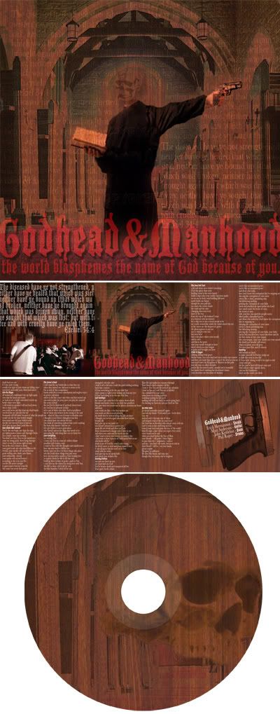
the only thing i would have done differently would be to remove the textured feel that the bible verse repeated on the cover creates. it was client specific, so i didn't want to stomp on their descisions. but i'm proud of it, and i know they liked it as well.
i've gone on to make 2 shirt designs for them. one of which i have to talk to their drummer about... the design was prepped for white ink, and he decided it would look cooler with black ink, despite making the image appeaer inverted and indecipherable. but i'm good friends with him, so i can rib him openly about screwing up my designs.
a few years back, i used to play in absent of. and one of the many bands we'd played with over the years was godhead & manhood, they were trying out second guitarists a few years after absent of. had broken up. and i obliged. ultimately, i didn't have the skills to stick around, but they kept me in mind for graphic design projects.
the title of the album is "the world blasphemes the name of god because of you" and is pointed at the hipocrisy of many practicing christians. they knew the art and idea was walking a tightrope, being a christian metal band and having such dark implicitly evil imagery has to handled with kid gloves, but they said "they'll deal with it, it will entice them to speak to us about it and allow us to explain to them what christianity really means to us." i said, "okay."
here, i made album and cd art for them:
the only thing i would have done differently would be to remove the textured feel that the bible verse repeated on the cover creates. it was client specific, so i didn't want to stomp on their descisions. but i'm proud of it, and i know they liked it as well.
i've gone on to make 2 shirt designs for them. one of which i have to talk to their drummer about... the design was prepped for white ink, and he decided it would look cooler with black ink, despite making the image appeaer inverted and indecipherable. but i'm good friends with him, so i can rib him openly about screwing up my designs.
two shirts for sale.
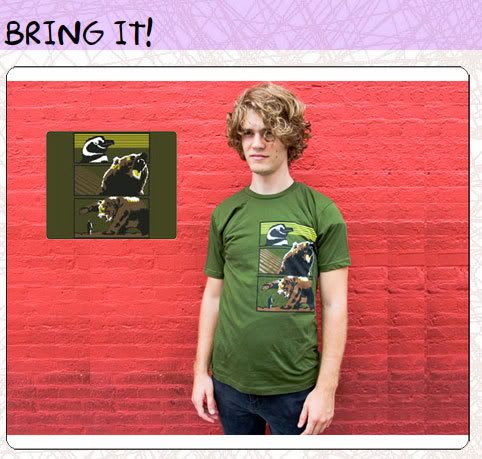
a few months back, sharp shirter bought a couple of my designs.
"bring it"
"african animal alliance"
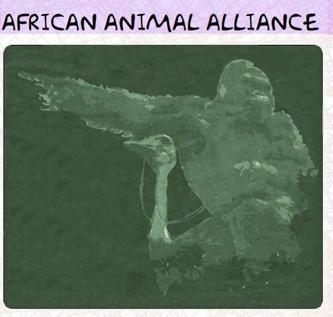
the second design is still on preorder (even i haven't recieved my shirts of the second design as part of the acquisition yet, so i'm guessing they're yet to hit the presses)
bring it was my first off center design i'd put together that i thougt worked well. african animal alliance had preceeded bring it by a number of months, but i only had that placement off center as it looked boring centered. and as far as i'm aware, sharp shirter plans on printing that off center as well.
african animal alliance was one of the few designs i'd created fully rasterized, usually i like to work with vectors. i did turn aaa into vector art for dan over at sharp shirter, but only to aide in getting it printed easier. this design had initially run in the threadless competition, and a voter had asked if it was influenced by donkey kong country, and as i can remember it now, they did indeed ride ostriches. even when i'm trying not to be influenced by the 80's and 90's, i fail.
"bring it"
"african animal alliance"
the second design is still on preorder (even i haven't recieved my shirts of the second design as part of the acquisition yet, so i'm guessing they're yet to hit the presses)
bring it was my first off center design i'd put together that i thougt worked well. african animal alliance had preceeded bring it by a number of months, but i only had that placement off center as it looked boring centered. and as far as i'm aware, sharp shirter plans on printing that off center as well.
african animal alliance was one of the few designs i'd created fully rasterized, usually i like to work with vectors. i did turn aaa into vector art for dan over at sharp shirter, but only to aide in getting it printed easier. this design had initially run in the threadless competition, and a voter had asked if it was influenced by donkey kong country, and as i can remember it now, they did indeed ride ostriches. even when i'm trying not to be influenced by the 80's and 90's, i fail.
skulls and zappers.
this is my latest non-paycheck design.
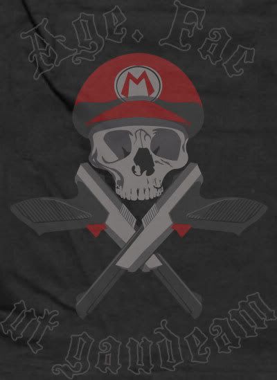
created for threadess, this design is for a specific competition. usually threadless has an ongoing competition with no boundaries and no themes. with a prize pack of $2,000 for a well scored design.
this design is particular to a competition titled "e for all", a video game themed contest.
so i dug out some clichés.
many voters on threadless hate guns and skulls and video game designs. but i liked the aesthetic these had together and i decided to pander to my own interests. i think this design in particular may cater to a different crowd, but threadless has been very open minded and awarded an array of different styles.
at any rate, i'm late to the game in posting this, as there's only a 7 day windo to vote... i've already lost 2 days.
so if you're not a member, join up. threadless has a great community of designers, even non designers who just dig design tend to hang out. but please vote on my piece and let me know what you think. too often i don't have many comments, so i have very little to learn from (outside of people not liking skulls and guns)

in the future, large versions of the images outside of the threadless template will make their way into this blog. so it will at least be more visually interesting to look at later.
created for threadess, this design is for a specific competition. usually threadless has an ongoing competition with no boundaries and no themes. with a prize pack of $2,000 for a well scored design.
this design is particular to a competition titled "e for all", a video game themed contest.
so i dug out some clichés.
many voters on threadless hate guns and skulls and video game designs. but i liked the aesthetic these had together and i decided to pander to my own interests. i think this design in particular may cater to a different crowd, but threadless has been very open minded and awarded an array of different styles.
at any rate, i'm late to the game in posting this, as there's only a 7 day windo to vote... i've already lost 2 days.
so if you're not a member, join up. threadless has a great community of designers, even non designers who just dig design tend to hang out. but please vote on my piece and let me know what you think. too often i don't have many comments, so i have very little to learn from (outside of people not liking skulls and guns)
in the future, large versions of the images outside of the threadless template will make their way into this blog. so it will at least be more visually interesting to look at later.
here i am.
now that i've amassed a decent stable of designs and web work, i figured it was time to create some proper web presence.
i have some web presence, but none of it is particularly for my design work.
you can find me on myspace, as well as many bands i've been in:
www.myspace.com/dannmatthews
www.myspace.com/ckasllab
www.myspace.com/absentof
you can see some videos that i've made (though these are not neccesarily indicative of my editting skills, more a look into what i do friday nights from 1am - 5am):
www.youtube.com/profile?user=PapaPrime
a look into my first run at design work (alot of which will be reposted here):
www.threadless.com/profile/211067/Papaprime/
and i'm certain that if you google dann matthews or papaprime all that and more will pop up. so feel free to e-stalk me.
this site will double as a place for me to post anything i deem creative and also as a storefront for my designs, as i'd like to move into my own home before i turn 30, and the only way i can see that happeneing is if i can profit off a few of my designs i spent my spare time unpaid creating.
Subscribe to:
Posts (Atom)