Sunday, December 30, 2007

bowler.

threadless is having a competition called threadless loves revolution, this contest is specifically made to get artists to move outside of their comfort zones, knowing what usually gets printed, some designers have been conforming their designs to match what may equal a payout; this is an attempt to change that up.

i put together a piece for this competition titled "bowler".

bowler.

bowler. - Threadless, Best T-shirts Ever

once voting is available for this shirt, please let me know what you think!

Tuesday, December 25, 2007

yo gabba gabba christmas

this christmas, our families pitched in to get my daughter all of the yo gabba gabba figures.

the first 2 were presented to her at our house, and brianna (my wife) and i set up this video to make it a little more fun for her.


merry christmas!

Thursday, December 20, 2007

my shirt is on defunker now?

defunker (a more artsy subsidiary of busted tees) now carries my african animal alliance design i sold to sharp shirter a while back.

i've known for a while that defunker carries other companies shirts after seeing a couple threadless shirts on their site. i guess i was suprised that it was sold to defunker. i understand that i sold the design away (for relatively cheap) and i hold no ill-will toward the guy i sold it to (this is the same guy who drafted me to make the rock obama design in the blog below this one).

i guess i'm a bit bashful that defunker liked my design enough to buy it, but i can't escape the feeling that the comment about the product on the product page might be insulting...

"This is the world's unfunniest Calvin and Hobbes. by Sharp Shirter"
african animal alliance
(image courtesy of sharp shirter's site)

maybe i'm entirely misreading it, as they liked it enough to buy it, right? is it a joke about the paradox between the two? i dunno, either i'm not smart enough (strong possibility) or it's a poorly written joke.

all that aside, it's a bit cool and frightening to stumble upon your own design by accident on the great wide net.

Wednesday, December 19, 2007

rock the vote...

i was contacted by te same guy who bought 2 of my designs for sharp shirter, he asked me to punk out a candidate.

looking into it, i was designing this to ultimately go on sale at up against the wall mall outlets. so it's cool to get my work into some malls, but i'll never see them, as they're based along the east coast. but i'm getting a few free shirts, so i can revel in those at least.

here's the design in question:

rock obama

this is the mohawk i alluded to , as i had my own shaved 2 days prior to working on this.

funny how mohawks travel in packs of two.

Sunday, December 16, 2007

pots 'n' pans rocker.

grab you wooden spoons and pray for a tolerant mother...

it's time to rock!

pots'n'pans rocker - Threadless, Best T-shirts Ever

pots'n'pansrocker

got a little nostalgic for annoying my mother, and thought of what the ultimate pots and pans drumkit would consist of.

a wok hi-hat, pan snare, cauldron kick, stewpot toms and a lid for a cymbal.

Tuesday, November 27, 2007

all the kids are doing it.

thought i'd give myself a haircut.

i used to shave my head every two weeks.

scratch that, when i lived with my parents, my dad would shave my head, now my wife shaves my head.

i've been sloppy in my old age, letting it grow out for months at a time. i hadn't shaved my head since the day after halloween. which i had to do that day, i had shaved portions of my hairline to mimic peter griffin's.

i decided to do something i've dreamed of since i was a punk rock teenager (i'm now a mid twenties metal head)

give myself a mohawk:
my malevolent mohawk.

the sad thing is, i'm a fat man with a mohawk... not the height of any fashion. and i've begun wearing polo shirts more often than t-shirts. so it doesn't really look proper, which makes me all the more proud of it.

it would have looked better on me in my prime teenage years, when i weighed a little less than half of what i do now:
skinny dann.
pardon the bad photo of an old driver's license. you may notice the comically oversized glasses... that's what you get when you try to find horn-rimmed glasses to fit your huge head when you live in alaska... but i digress.

i have sported a mohawk before, but because i spent 9 years working at video stores, i knew that my mohawk would be frowned upon and my poor mohawks never survived past the weekend.

i usually saved my mohawks for weekend's when my band played, to try and look just a little cooler than i really was.

why a mohawk now? why wear a hairstyle that defies my weight?

because i can! i finally have a job as a graphic designer where i'm free to do everything short of offend coworker's realistic sensibilities.

i even tried to pussy out. my boss greeted me on monday and said he loved my mohawk, i instantly asked him if he thought it would be a problem with clients. he has no problem with it.

so i proudly wear my 3 quarters cold hairstyle, giving little old bigoted ladies a new reason to clutch their purse as they walked by (remember, i'm half black, and short of that they might think i'm mexican or native american, both of which evoke the same reaction here in duluth/superior)

viva la outdated/outmoded hairstyle!

i also spent a good portion of my evening placing a mohawk on my favorite candidate running for election next year to make a few bucks. i'll blog about that once i submit the final version to the folks putting it into print. (foreshadowing!!!!!!!!)

Tuesday, November 20, 2007

dragons & vinyl.

placed another threadless design into the competition.

couldn't think of a great title, so this one is simply titled "lp."

lp.

lp. - Threadless, Best T-shirts Ever

click and let me know what you think!

Friday, November 16, 2007

crude animation: the sequel

my daughter and i collab'd on another little animation project.

more than double the length of its predecessor, and even more crude 3 year old humor!

enjoy.


edit: new video.

had a little patch of time, decided to make another one:

Monday, November 12, 2007

two new shirts to vote on.

I seem to have a thing for skulls lately. You can vote here and here.

meet death.

chief.

Sunday, November 11, 2007

big little monster.

i spent a little time making a cartoon of my daughter's story and artwork:

Friday, November 9, 2007

sesame street fighter.

here's my latest threadless design turned around for the chance at a profit.

once again put up on bountee for a meager profit.

sesame street fighter.

buy it before i'm somehow sued for parody!

in men's, women's and kid's sizes.

Tuesday, November 6, 2007

i have a "new" design up for vote at
design by hümans
called epacock rock.

peacock rock.

this is yet another design i ran through the ringer over at threadless first.

Peacock Rock - Threadless, Best T-shirts Ever

i figured this design could take decent advantage of design by hüman's use of silver ink and other printing oddities.

do me a favor, join and vote.

Monday, November 5, 2007

buy my shirt.

i've been designing for multiple shirt competitions all over the wide wild net.

but bountee gives designer's a chance to make both the company and the designer a little bit of scratch. they sell the shirts for a set cost, and the designer can create the mark-up to see what they take home.

on bountee i'm only taking in about $3 per design sold, but i'm not upset by that. i'm more pleased at the opportunity to spread the love.

the design i've put up for sale is an oldie but a goody:

fruit luips.

this is another one i had originally entered over at threadless:
Fruit Luips - Threadless, Best T-shirts Ever

well, iffin' you're in the mood for a bright colorful shirt, and my "fruit luips" word play made you smirk, toss me $3 (and bountee $17)

thanks.

my first logo.

i've been making little logos here and there for some time now.

but i thought i'd share my first big time logo (regionally big time)

first one i was paid for at least.

lake dental (read more about them in the previous blog)

here is the logo.

lake dental logo.

the wave is there to denote the lake (lake superior to be exact) an element they wanted in the design, and the 2 fonts are there for a masculine/feminine feel for the married couple that owns and works there.

the wave made more sense when we were working in a blue color scheme (as you'll see below) but we finally got with the interior designer and saw that copper and a deep burgandy like color were the accents.

this is the actual final logo:

lake dental logo.

the text at the bottom was insisted upon, otherwise i personally would have left them out.

here are sone of the 2nd phase logos i was playing with for them:

lake dental logos.

this was the first phase where i was playing with differing typefaces to round our the feel.

and finally, here are some of the first draft designs:

lake dental logos.

here i was really broadly getting a feel, as i had never spoken with the client and was just playing around, keep in mind, these weren't all of the designs, as in each stage, the final existed in some form or another.

i was very pleased that i was handed this task. i went to school for graphic design with the thought that i would snare a job where all i did was resize ads.

the first task i had at my current job was resizing an ad.... but these logos were my second. i could not have been more pleased.

Wednesday, October 31, 2007

a sordid state of affairs.

i had created a coming soon sign for a local dental building a few weeks back.

there was an incredible hubbub as the sign company printed up the board, and then left it at the wrong work site.

after a day of phone calls, at five, the client called and the sign was still at the wrong place, so a little overtime getting abck with the sign company.

that night it's in the right spot, and i'm pleased as this is the closest to a billboard i've done in my professional career.

the next morning, the client calls us to inform us it's blown over as it wasn't weighted down.

we call the sign company again asking where the cinderblocks they spoke of (placed at the wrong site) didn't travel with the sign. they inform us they can't fix it till five.

my creative director and i decide to go and buy and place the cinderblocks ourselves.

we get to the site only to find the sign in three (3) pieces!

we haul the cinderblocks to the sign shop, let them know what's what; and thanks to their poor performance earlier, they are fixxing the sign.

it's up that night.

it's up monday morning.

monday afternoon... it's in three pieces, again.

my boss heads down and finds some "guilty puppy dog" reactions from the construction crew... one theory is that they got annoyed that they had to move it, so they busted it up... then when it was back up again, they were even more annoyed.

another theory revolves around some pickiters. it seems source group hired non union electricians, and they've had pickiters at their site.

then my boss nearly had a fit when she saw this headline:

confrontation at construction site

all our people involved, but luckily a different construction site... in fact, the one down the street that the sign company had erroniously placed the coming soon sign.

and to top it all off, this morning, there was a large sign outside of our sign's construction site stating "m&i bank funded" or something to that effect... turns out, that sign belonged at the other site...

what a sordid state of affairs.

may i present, peter griffin.

peter griffin.
peter griffin.

shaved little parts of my hair to be styled like peters.

created a butt-chin out of a styrafoam ball cur in half, hollowed and painted (kinda like) my skintone.

grabbed a pack of bloodshot eye glasses, took out the bloodshot and painted over the blue eye color for black pupils.

bought a white polo.

viola.

peter griffin.

Thursday, October 25, 2007

guitars revisited.

as seen in my last blog, i recently joined design by hümans and popped in an old design, and an unused design.

insomnia struck once again last night, and i decided to reinvigorate an old design.

i took this piece, and the critiques on this page to heart.

roots.

I then decided to redesign it and submit it here.

guitree.

i like the new one.

Wednesday, October 24, 2007

design by humans

i stumbled onto a tshirt contest site called design by hümans

it takes a page from threadless and some pages from places like Oddica and Bountee.

the contest element (from threadless) wins you some more money.

the percentages the artists take home (Oddica and Bountee both do this) are a welcome addition to the expanded prize money.

and finally, the printing techniques are the most immersive i've seen on any of those other sites.

i've set up my own design by hümans account and i've already submitted a couple of designs.

i was led into the site knowing that they tend towards the artistic designs, and less cartoony. So I went through my personal library of designs and nabbed this one:

rock monster.

i also decided to add one that i always thought was a little too out there for threadless:

ghost.

feel free to join design by hümans and let me know what you think of my (and other's) designs.

Sunday, October 21, 2007

early adventures in design.

i began design by simply playing around in mspaint. creating random internet pictures trying too hard to make internet friends.

one of my favorite early mspaint designs was for my dad's birthday. i had taken an image of his head, slapped on his (early) nickname with some "typography skills" and made some shirts for the family.

i no longer have the still image (and the business that originally printed the shirts lost the screen) so this annoying animated gif will have to suffice.

montana flash

a year later, my mspaint skills had increased slightly, and my dad had another birthday, so the branding continued:

montana flash, represent

after seeing some of the random designs i had put together and made into shirts, a blockbuster coworker (i worked there for 7 years out of a 9 year video store career) who was in school for design started a fire under my ass suggesting i get into school for graphic design.

a year later, i decided to go for it and started some schooling. here is the second design i made for school, mind you, we had yet to touch the macs or any adobe programming, so this is still very much an mspaint project:

spray paint project

not the best looking work ever, but i'm still proud of my roots.

Saturday, October 20, 2007

halloween curse.

the annual curse has taken place.

3 months prior, i get stoked for a costume idea.

1 month prior, i begin planning everyhting down to the smallest detail.

2 weeks prior, i finally nab all the gear i need.

1 week, 6 days and 23 hours prior, i finally see that my costume looks nothing like i had planned it.

1 week, 6 days prior, i run back to each and every store and return items and swap out for alternates.

1 week, 5 days and 23 hours prior i remain dissatisfied.

3 days prior i come to grips with how bad it looks.

1 hour before going to work, i contemplate leaving it all behind.

3 minutes before work, i sink low in my car's seat hoping the only people to see me are my few coworkers and my family.

to leave on a happier note, here's a few where everything turned out nicely:

Papa the Clown

Mr T. the Blockbuster Employee

Friday, October 12, 2007

before it's cliche.

i decided to make a youtube page for my daughter.

1) because i was bored and wanted to do something creative that evening

2) because this is a quick easy way to preserve her at this age

3) because youtube blogging is becoming more and more passé, so she'll be able to show in 10 years she can say she did it before it wasn't cool.

i know i should really use my time editting to bone up on my editting skills... but i get bored subtitling it after a very short while.

speaking of editting, i did my first chunk of editting for pay today at work. the irony is that the creative department at my work doesn't meet the clients outside of creative meetings et al. but we were under odd circumstances and were asked to run to a car dealer with a budget for some web work i'd be doing. the guy had already gone over what he wanted to do with the page, yet when we got there, he was resistant to everything... despite them being his ideas.

at any rate, he basically said no and made us feel uncomfortable. yet today, a month or so later, i'm editting some v.o.d. clips for his website... the exact thing he made us feel small over.

i'm glad i'm not a salesman.

end rant.

i'm gald i'm getting a little bit of a handle on final cut pro. i've been so used to imovies lackluster control that i've become dependant on workarounds, so it's nice to feel the ability to stretch my creative mind with livetype and final cut.

Friday, September 21, 2007

i must be new to this internet thing.

i recently found out that all the images on my blog weren't visible, because i posted them to a file share forum discussion, and it appears you have to register and log in to see any images.

so if you'd been through my blogs before (all 10 of you), welcome back to "..." V 2.0, now with working images.

dann mathews: tattoo designer.

my boss asked me to design a tattoo for him so he could get inked before he heads off on vacation.

his wife (another boss of mine) had inked a beautiful design commemorating her succesfully having cancer removed. and she is so in love with her tattoo that she talked her husband into it.

my boss is a knights templar free mason (i'm sure i got some of that wrong, i know more about the springfield stonecutter's than i do of the masonic societies)

so he asked me to mix in a few elements: the double barred cross, a sword, some icons and the wings.

so i put this together, mashing them all together:

my boss's tattoo.

(that bar above the "G" icon appeared during file compression... i was too lazy to get the source file from work to fix it)

i'm pleased with it, the only things i didn't draw by hand were the icons on the crest (as they're too small to worry about the detail in the time crunch i was under) and the wings. the wings are from an existing tattoo design.

he's getting this on his bicep, it should look cool. he just wanted something more than the compas and all seeing eye that alot of other masons get inked in.

it was an interesting diversion for a day where a client called my work "crap".

i'm not sassy enough.

my creative director and me were put to the task of making logos for a diner.

we were given an outline of them being sassy and known as the "hidden jewel of duluth", so we set out.

i had come up with these.

rejected uncle loui's logos

i obviously was rather fond of them, but none of them were picked.

after meeting them, it is obvious why they gravitated towards the one that the did, and had i met them prior to creating the logos, i would have changed the design knowing their general attitude.

i got a new layer of thick skin as they placed my 3 mouted foamcore boards aside and said out loud "these 3 are crap" and then backpeddaled a bit and explained that they are too contemporary, which i agree entirely. i held back a tiny wince at the word "crap" though.

what can i say, i'm not sassy enough.

(all logos shown are owned by carlson media inc., my employer)

Thursday, September 20, 2007

righteous robo roundup.

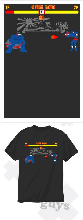
as a huge transformers fan, i've always been keen on robots of all sorts.

i decided to run through some vector designs i'd made over the past 2.5 years and was actually suprised at their numbers.

here they all are, titles and explanations after the images. and if you like any of these, they are all for sale currently.

robots by dann matthews

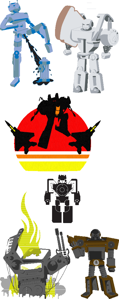
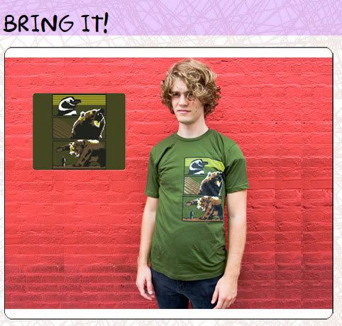
#1 a radom sketch of a robot "peeing" on a fire hydrant like a dog. this was done prior to the transformer movie's polarizing scene of bumblebee doing the same thing. this was one of the first pieces of vector art that i completed from sketch to screen. i created it as a possible threadless design; but i blogged about it as a work in progress and it wasn't well recieved so i shelved it.

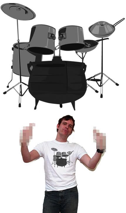
#2 this guy is my favorite and he made it into my personal portfolio. toastor! he made his rounds through threadless
TOASTOR! - Threadless, Best T-shirts Ever
i was very pleased with the execution, especially since this was the first sketch to screen vector i shared with the masses. this little guy also has a backstory:

"TOASTOR
'I will butter the charred chassis of my enemies... then sprinkle fresh cinnamon on their remains!'
Toastor is the maniacal leader of the evil Appliance Defiance squad. In battle, his strategies are unmatched, leaving many of the Utensil Defense soldiers sent to the dishwasher of doom. After burning one too many slices of toast, society tossed him aside. After emerging from an alleyway trashcan, he amassed an army of the disposed, and ever since, the "Appliance Defiance" has been taking over the world... one kitchen at a time."

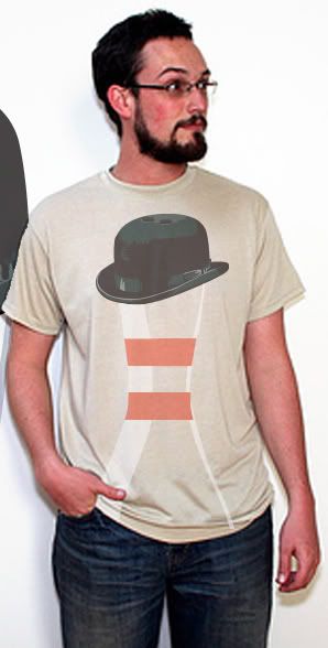
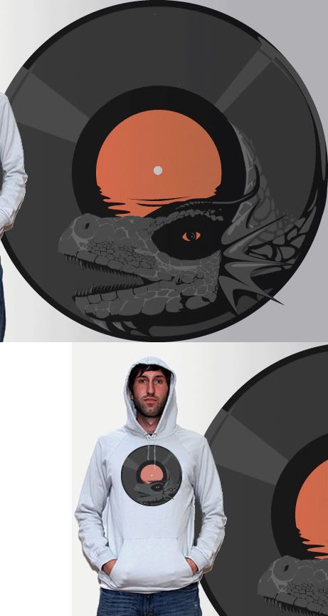
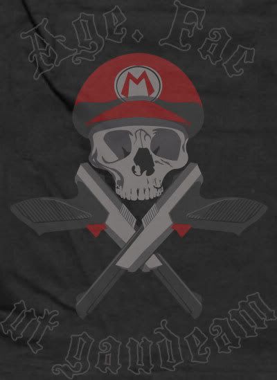
#3 here's a design titled "seekers" showcasing the 3 generation one transformers jets making up the team by the same name. i wanted to place their sihouettes against a very vintage looking sun design. never did anything else with this one.

#4 a transforming ipod. modeled after soundwave, one of the more popular generation one transformers that changed into a tape deck, i thought this was a novel idea... but wait a few years, and it exists. as big a fan of transformers as i am, i had to hold back on an overly expensive mp3 player, when i already have an ipod stuffed with 6,000+ songs

#5 "rock monster" this guy also ran his threadless course:
Music Kills - Threadless, Best T-shirts Ever
just an abstract idea i had that i wanted to see come to life. this was the first time i played with swatches (for the smoke and fire) and got the swawtches to work well.

#6 and lastly, "back burner" another soldier in the appliance defiance. i had fun making him, but after toastor scored so low on threadless, i decided against adding him to the competition. he has his own story as well:
"Back Burner
The once proud stovetop oven cooked thousands of family meals. After his owner's house sold to a young couple, they opted for a "less drab" color scheme in the house and tossed him to the back curb. It was there that Back Burner met Toastor and joined the ranks of the Appliance Defiance. The muscle of the group, he remains quiet and stoic, and loyal to Toastor's cause. He has been known to overkill "innovative" appliance's, like refrigerators with LCD screens, during raids; a rage issue Toastor secretly hopes he never has to reign in."

so there is my vector robot collection (paling in comparison to my plastic robot army, taking up real estate in 9 large tubs in my closet).

again, these are all for sale, if anyone loves robots as much as i do, let me know.

Wednesday, September 19, 2007

obsessed with 15 year old boys.

my wife (specifically) and i caught hold of a youtube all-star.

daxflame.

the first vlog we saw of his was his last blog ever.

at first we were amused by a kid with obvious mental instabilities.

months later, we watched more of his videos, and as we started from video one and worked our way toward video 100, we found plainly obvious that he was acting. but he's and incredible actor. his commitment to the character rivals that of will ferrel's best work.

so now my wife and i sit on pins and needles awaiting his new videos. last week, i was working on an aforementioned rap song.

i thought it would be funny to take that beat and make a rap song about daxflame.

be warned, if you don't know the ins and outs of bernice daxflame juach's world, the lyrics will be confusing, but still give it a listen for the beats, i'm proud of them and the song is barely over a minute long as is.

jesus was a headbanger.

i've been in ska bands, punk bands (ska punk bands), metal bands, hell, i've even used garageband to make a few rap and r&b songs.

a few years back, i used to play in absent of. and one of the many bands we'd played with over the years was godhead & manhood, they were trying out second guitarists a few years after absent of. had broken up. and i obliged. ultimately, i didn't have the skills to stick around, but they kept me in mind for graphic design projects.

the title of the album is "the world blasphemes the name of god because of you" and is pointed at the hipocrisy of many practicing christians. they knew the art and idea was walking a tightrope, being a christian metal band and having such dark implicitly evil imagery has to handled with kid gloves, but they said "they'll deal with it, it will entice them to speak to us about it and allow us to explain to them what christianity really means to us." i said, "okay."

here, i made album and cd art for them:

godhead & manhood album art.

the only thing i would have done differently would be to remove the textured feel that the bible verse repeated on the cover creates. it was client specific, so i didn't want to stomp on their descisions. but i'm proud of it, and i know they liked it as well.

i've gone on to make 2 shirt designs for them. one of which i have to talk to their drummer about... the design was prepped for white ink, and he decided it would look cooler with black ink, despite making the image appeaer inverted and indecipherable. but i'm good friends with him, so i can rib him openly about screwing up my designs.

two shirts for sale.

a few months back, sharp shirter bought a couple of my designs.

"bring it"
bring it

"african animal alliance"
african animal alliance

the second design is still on preorder (even i haven't recieved my shirts of the second design as part of the acquisition yet, so i'm guessing they're yet to hit the presses)

bring it was my first off center design i'd put together that i thougt worked well. african animal alliance had preceeded bring it by a number of months, but i only had that placement off center as it looked boring centered. and as far as i'm aware, sharp shirter plans on printing that off center as well.

african animal alliance was one of the few designs i'd created fully rasterized, usually i like to work with vectors. i did turn aaa into vector art for dan over at sharp shirter, but only to aide in getting it printed easier. this design had initially run in the threadless competition, and a voter had asked if it was influenced by donkey kong country, and as i can remember it now, they did indeed ride ostriches. even when i'm trying not to be influenced by the 80's and 90's, i fail.

skulls and zappers.

this is my latest non-paycheck design.

age. fac ut gaudeam

created for threadess, this design is for a specific competition. usually threadless has an ongoing competition with no boundaries and no themes. with a prize pack of $2,000 for a well scored design.

this design is particular to a competition titled "e for all", a video game themed contest.

so i dug out some clichés.

many voters on threadless hate guns and skulls and video game designs. but i liked the aesthetic these had together and i decided to pander to my own interests. i think this design in particular may cater to a different crowd, but threadless has been very open minded and awarded an array of different styles.

at any rate, i'm late to the game in posting this, as there's only a 7 day windo to vote... i've already lost 2 days.

so if you're not a member, join up. threadless has a great community of designers, even non designers who just dig design tend to hang out. but please vote on my piece and let me know what you think. too often i don't have many comments, so i have very little to learn from (outside of people not liking skulls and guns)


age. fac ut gaudeam - Threadless, Best T-shirts Ever

in the future, large versions of the images outside of the threadless template will make their way into this blog. so it will at least be more visually interesting to look at later.

here i am.

now that i've amassed a decent stable of designs and web work, i figured it was time to create some proper web presence.

i have some web presence, but none of it is particularly for my design work.

you can find me on myspace, as well as many bands i've been in:

www.myspace.com/dannmatthews

www.myspace.com/ckasllab

www.myspace.com/absentof

you can see some videos that i've made (though these are not neccesarily indicative of my editting skills, more a look into what i do friday nights from 1am - 5am):

www.youtube.com/profile?user=PapaPrime

a look into my first run at design work (alot of which will be reposted here):

www.threadless.com/profile/211067/Papaprime/

and i'm certain that if you google dann matthews or papaprime all that and more will pop up. so feel free to e-stalk me.

this site will double as a place for me to post anything i deem creative and also as a storefront for my designs, as i'd like to move into my own home before i turn 30, and the only way i can see that happeneing is if i can profit off a few of my designs i spent my spare time unpaid creating.