thought i'd give myself a haircut.
i used to shave my head every two weeks.
scratch that, when i lived with my parents, my dad would shave my head, now my wife shaves my head.
i've been sloppy in my old age, letting it grow out for months at a time. i hadn't shaved my head since the day after halloween. which i had to do that day, i had shaved portions of my hairline to mimic peter griffin's.
i decided to do something i've dreamed of since i was a punk rock teenager (i'm now a mid twenties metal head)
give myself a mohawk:
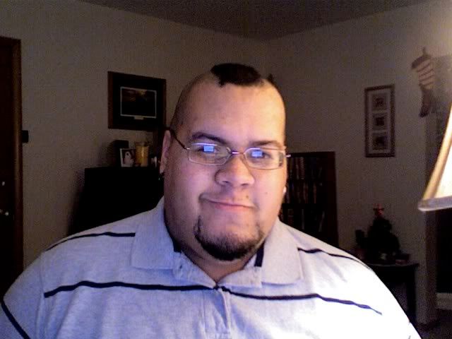
the sad thing is, i'm a fat man with a mohawk... not the height of any fashion. and i've begun wearing polo shirts more often than t-shirts. so it doesn't really look proper, which makes me all the more proud of it.
it would have looked better on me in my prime teenage years, when i weighed a little less than half of what i do now:
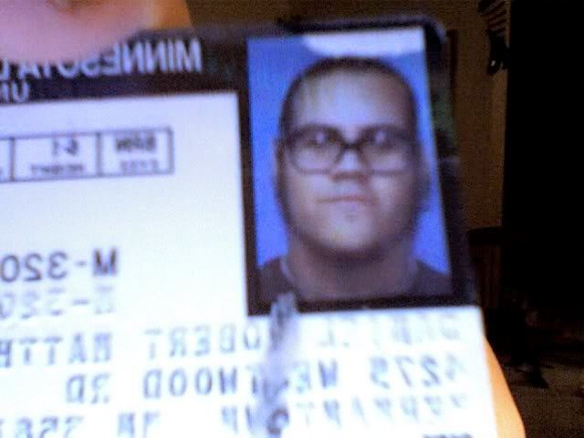
pardon the bad photo of an old driver's license. you may notice the comically oversized glasses... that's what you get when you try to find horn-rimmed glasses to fit your huge head when you live in alaska... but i digress.
i have sported a mohawk before, but because i spent 9 years working at video stores, i knew that my mohawk would be frowned upon and my poor mohawks never survived past the weekend.
i usually saved my mohawks for weekend's when my band played, to try and look just a little cooler than i really was.
why a mohawk now? why wear a hairstyle that defies my weight?
because i can! i finally have a job as a graphic designer where i'm free to do everything short of offend coworker's realistic sensibilities.
i even tried to pussy out. my boss greeted me on monday and said he loved my mohawk, i instantly asked him if he thought it would be a problem with clients. he has no problem with it.
so i proudly wear my 3 quarters cold hairstyle, giving little old bigoted ladies a new reason to clutch their purse as they walked by (remember, i'm half black, and short of that they might think i'm mexican or native american, both of which evoke the same reaction here in duluth/superior)
viva la outdated/outmoded hairstyle!
i also spent a good portion of my evening placing a mohawk on my favorite candidate running for election next year to make a few bucks. i'll blog about that once i submit the final version to the folks putting it into print. (foreshadowing!!!!!!!!)
Tuesday, November 27, 2007
Tuesday, November 20, 2007
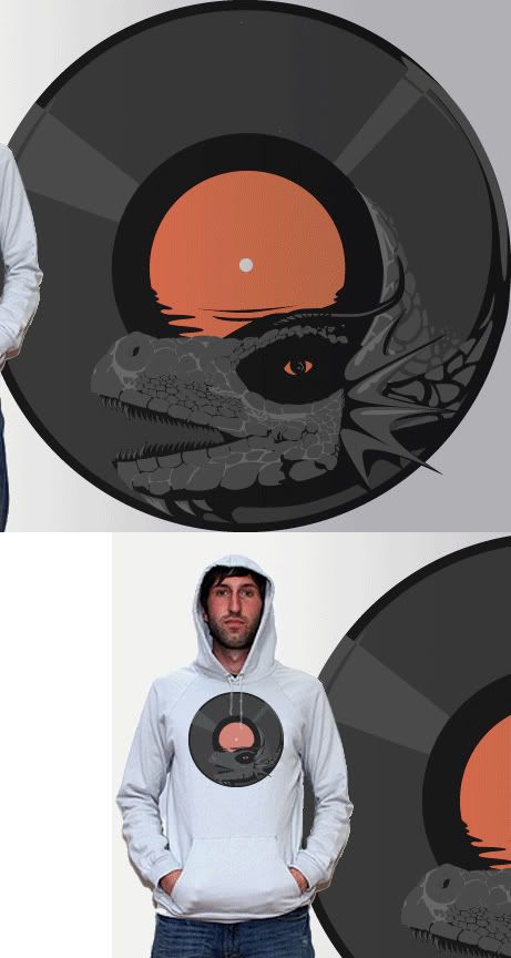
dragons & vinyl.
placed another threadless design into the competition.
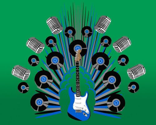
couldn't think of a great title, so this one is simply titled "lp."
click and let me know what you think!
couldn't think of a great title, so this one is simply titled "lp."
click and let me know what you think!
Friday, November 16, 2007
crude animation: the sequel
my daughter and i collab'd on another little animation project.
more than double the length of its predecessor, and even more crude 3 year old humor!
enjoy.
edit: new video.
had a little patch of time, decided to make another one:
more than double the length of its predecessor, and even more crude 3 year old humor!
enjoy.
edit: new video.
had a little patch of time, decided to make another one:
Monday, November 12, 2007
Sunday, November 11, 2007
Friday, November 9, 2007
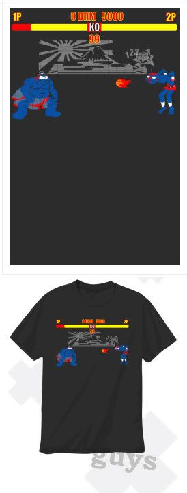
sesame street fighter.
here's my latest threadless design turned around for the chance at a profit.
once again put up on bountee for a meager profit.
buy it before i'm somehow sued for parody!
in men's, women's and kid's sizes.
once again put up on bountee for a meager profit.
buy it before i'm somehow sued for parody!
in men's, women's and kid's sizes.
Tuesday, November 6, 2007
i have a "new" design up for vote at
design by hümans called epacock rock.
this is yet another design i ran through the ringer over at threadless first.
i figured this design could take decent advantage of design by hüman's use of silver ink and other printing oddities.
do me a favor, join and vote.
design by hümans called epacock rock.
this is yet another design i ran through the ringer over at threadless first.
i figured this design could take decent advantage of design by hüman's use of silver ink and other printing oddities.
do me a favor, join and vote.
Monday, November 5, 2007
buy my shirt.
i've been designing for multiple shirt competitions all over the wide wild net.
but bountee gives designer's a chance to make both the company and the designer a little bit of scratch. they sell the shirts for a set cost, and the designer can create the mark-up to see what they take home.
on bountee i'm only taking in about $3 per design sold, but i'm not upset by that. i'm more pleased at the opportunity to spread the love.
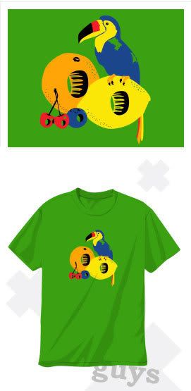
the design i've put up for sale is an oldie but a goody:
this is another one i had originally entered over at threadless:
well, iffin' you're in the mood for a bright colorful shirt, and my "fruit luips" word play made you smirk, toss me $3 (and bountee $17)
thanks.
my first logo.
i've been making little logos here and there for some time now.
but i thought i'd share my first big time logo (regionally big time)
first one i was paid for at least.
lake dental (read more about them in the previous blog)
here is the logo.
the wave is there to denote the lake (lake superior to be exact) an element they wanted in the design, and the 2 fonts are there for a masculine/feminine feel for the married couple that owns and works there.
the wave made more sense when we were working in a blue color scheme (as you'll see below) but we finally got with the interior designer and saw that copper and a deep burgandy like color were the accents.
this is the actual final logo:
the text at the bottom was insisted upon, otherwise i personally would have left them out.
here are sone of the 2nd phase logos i was playing with for them:
this was the first phase where i was playing with differing typefaces to round our the feel.
and finally, here are some of the first draft designs:
here i was really broadly getting a feel, as i had never spoken with the client and was just playing around, keep in mind, these weren't all of the designs, as in each stage, the final existed in some form or another.
i was very pleased that i was handed this task. i went to school for graphic design with the thought that i would snare a job where all i did was resize ads.
the first task i had at my current job was resizing an ad.... but these logos were my second. i could not have been more pleased.
Subscribe to:
Posts (Atom)