Showing posts with label logo. Show all posts

Saturday, September 26, 2009

wake me up when october begins.

t-minus 12 days until the family moves into the new house.

i've been working on a lot of favors and a collab that have been swept into an oft forgotten corner of my mind. i apologize if you are one of these 4 or so people. i'm trying my darndest to remain creative with a house full of boxes.

threadless recently reprinted "picket." so if you missed your chance to nab "picket.", try, try again.

i recently sold a currently "secret" design to culture twist so i'm having my first design printed overseas.

i want to give a quick thank you to robbie lee. he helped me get my foot in the door at shirt.woot and eased my trepidation when i recently entered a deal with culture twist. i seem to trail him by a few days at various shirt sites, and he was recently printed at design by hümans, so i'm knocking on wood, crossing my fingers and throwing table salt over my shoulder in hopes that i finally get a print there.

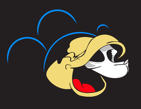
i recently vectorized an earlier sketch of mickey being torn asunder:
the unveiling.

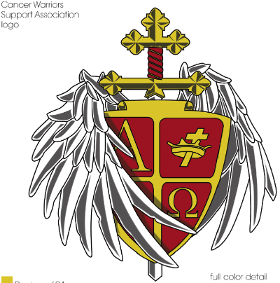
and made a logo for my uncle's construction company:
phoenix construction "3d".

there's another design you've already seen in these blogs that will be printed somewhere on the internet sometime soon as well. as a matter of course, this is also a secret. the world of t-shirt design is very secretive, mysterious, and treacherous, friends.

Monday, February 9, 2009

mid-february extravaganza!

lots of stuff going on, including a couple of ego-strokes i'm not yet at liberty to discuss.

i've submitted a few more designs to loiter:

oh, really fool?
lincoln logs.
lambchops.
endo-r.

i'm putting together a website for a church my grandfather is a part of, i don't have the site built yet, but i put together a logo for them that i'm currently pretty keen on:

crown of life ministries

and i also was charged with the creative challenge of making a visually interesting commercial for braggame rights (a local gaming store) with nothing but a pre-existing radio ad, so i put together the graphics and artistic direction for this ad:

Tuesday, December 30, 2008

tattoos for cancer.

a long while ago, when i first started blogging, i had pieced together a tattoo for my old boss.

a week ago, right before christmas. a gentleman e-mailed me asking about that very tattoo.

i don't know if he found it on a google image search or what, but he wanted to use it for his group, "cancer warriors support association". i said sure, and immediately thought of all the pitfalls they would face when attempting to use that lo-res sketchy image i had created. so i offered to create a vector file and a full logo packet and guide for him. he was pleased and thankful, but i had 3 days off of work for the holidays. i needed an excuse to keep my design brain working anyway.

so i presented him with this on christmas day:

cancer warriors support association.

merry christmas, cancer warriors support association!

Thursday, February 7, 2008

logo hits the big time.

the first professional logo i created (chronicled here) has finally hit the big time.

i am so pleased to see something i created in such a grand scale (another step closer to a billboard).

this sign is about 8 feet wide to give some scope to it. todd signs of duluth created it based off our collective specs. painted pvc for the logo, a sanded texture for the background and the "family/cosmetic" copy at the bottom is struck out of the sandy texture.

lake dental logo real big like.

me so happy.

Monday, November 5, 2007

my first logo.

i've been making little logos here and there for some time now.

but i thought i'd share my first big time logo (regionally big time)

first one i was paid for at least.

lake dental (read more about them in the previous blog)

here is the logo.

lake dental logo.

the wave is there to denote the lake (lake superior to be exact) an element they wanted in the design, and the 2 fonts are there for a masculine/feminine feel for the married couple that owns and works there.

the wave made more sense when we were working in a blue color scheme (as you'll see below) but we finally got with the interior designer and saw that copper and a deep burgandy like color were the accents.

this is the actual final logo:

lake dental logo.

the text at the bottom was insisted upon, otherwise i personally would have left them out.

here are sone of the 2nd phase logos i was playing with for them:

lake dental logos.

this was the first phase where i was playing with differing typefaces to round our the feel.

and finally, here are some of the first draft designs:

lake dental logos.

here i was really broadly getting a feel, as i had never spoken with the client and was just playing around, keep in mind, these weren't all of the designs, as in each stage, the final existed in some form or another.

i was very pleased that i was handed this task. i went to school for graphic design with the thought that i would snare a job where all i did was resize ads.

the first task i had at my current job was resizing an ad.... but these logos were my second. i could not have been more pleased.