
i had to translate 3 paragraphs worth of copy into an 8.5x11 handout.
i will file this as my first well made typographical project.
i usually battle typography, but i was able to turn all the text into a design.

i'm not used to tooting my own horn and i apologize, i hope you enjoyed my toot.
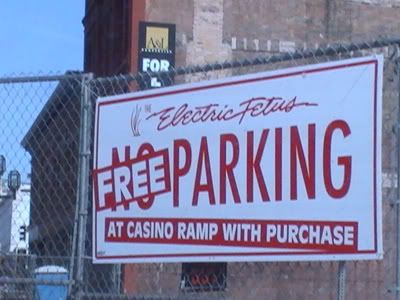
to keep the tootin' common (tutankhamen... king tut.... i am hilarious) here's a sign i had made for them earlier this year:


No comments:
Post a Comment