a long while ago, when i first started blogging, i had pieced together a tattoo for my old boss.
a week ago, right before christmas. a gentleman e-mailed me asking about that very tattoo.
i don't know if he found it on a google image search or what, but he wanted to use it for his group, "cancer warriors support association". i said sure, and immediately thought of all the pitfalls they would face when attempting to use that lo-res sketchy image i had created. so i offered to create a vector file and a full logo packet and guide for him. he was pleased and thankful, but i had 3 days off of work for the holidays. i needed an excuse to keep my design brain working anyway.
so i presented him with this on christmas day:
merry christmas, cancer warriors support association!
Tuesday, December 30, 2008
tattoos for cancer.
Labels:
association,
cancer,
dann,
dann matthews,
design,
logo,
support,
warriors
Sunday, December 21, 2008
nelson&company wish list.
at work, we conspired to come up with a fun and goofy holiday card. i modeled it after a department stores holiday toy guide or wish book. i thought it would be cool to rebuild the card with a simple flash interface so people who aren't on the company mailing list could see it as well:
nelson&company store
my boss, bill, and i then joked about making a "cartoon" starring the toy characters. then it became a reality. after a short bit of thinking on bill's part, we nixed the pg-13 version and replaced it with the pg rated version you can find on the page.
happy holidays!
nelson&company store
my boss, bill, and i then joked about making a "cartoon" starring the toy characters. then it became a reality. after a short bit of thinking on bill's part, we nixed the pg-13 version and replaced it with the pg rated version you can find on the page.
happy holidays!
jugg band.
i've been gone for a bit, busy at work. i've neglected my designs!
i have a couple cool things to post on christmas day, but i'll wait to avoid spoiling the surprise.
i literally had a soda pop and pie party on friday, we watched punky brewster and tried to make the seemingly lame exciting. and it worked. but we took a break from lame to play rock band. and while i was getting far too intense jamming on a plastic guitar, i popped my knee out of it's socket and now i'll have a limp for a while.
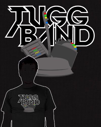
so while seated today, i put this together:
i also have it up for critique at threadess.
Saturday, October 25, 2008
tractor beam.
the visual puns continue!
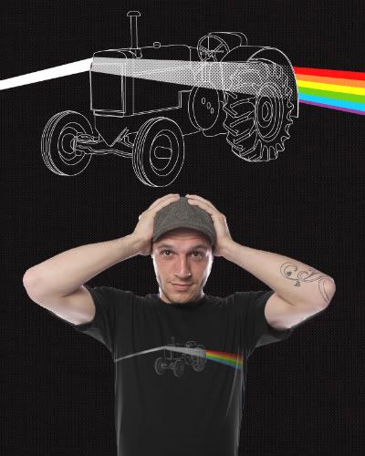
this one is titled tractor beam:
get it?!
ha!
this one will be up at threadless soon:
this one is titled tractor beam:
get it?!
ha!
this one will be up at threadless soon:
Thursday, October 23, 2008
monster league baseball.
i've been having fun making these guys. i think i will pursue printing these up!
you can check the previous batch in the last blog post, here are the new teammates / rivals:
Saturday, October 18, 2008
meet bocefus.
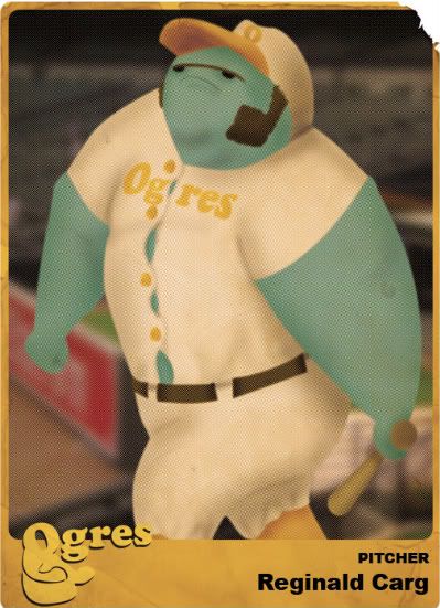
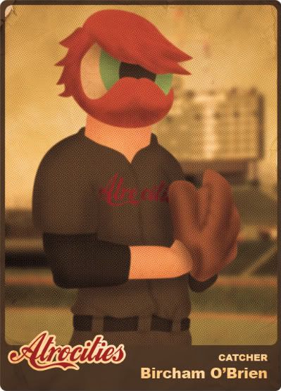
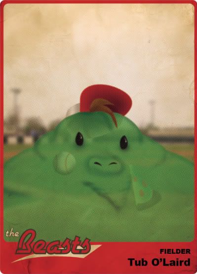
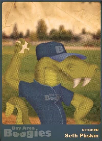
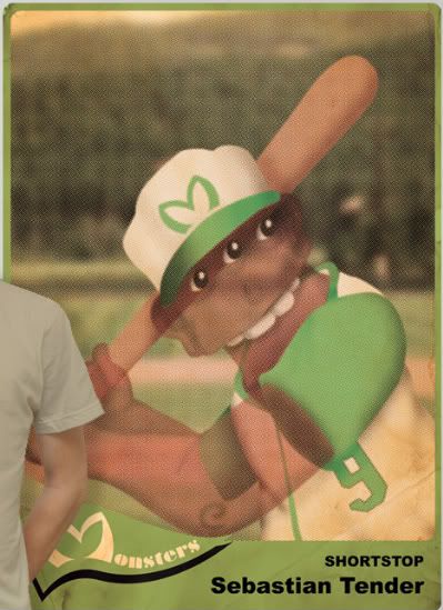
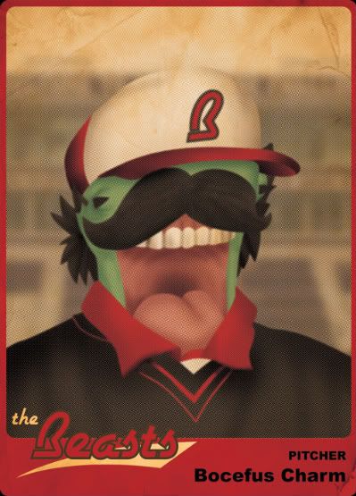
bocefus and the gang (reginald and sebastian round out the crew thus far) are pro baseball players from the middle of the last decade. at least, that's the style i was going for when i created these "vintage" monster league baseball cards for a threadless shirt submission.
i started the project out as simple sketches of a monster posing for a baseball card. then after i outlined it all in illustrator, i decided to toss the whole mix into photoshop and model it after an actual aged vintage baseball card.
i started with sebastian tender here:
after mocking him up on a shirt, it looked very plain, and i asked some folks over on the threadless blogs for some critiques and i had to agree with the suggestion of adding more to mix it up a bit.
thus, was born bocefus charm:
i also put together the back of another card to get a well-rounded pile of cards feel to it (seen in the link below) and then placed them all on the shirt:
ideally, i'd love to make 23 more of these guys (including a picture of the lumbering reginald carg) and actually have them professionally printed to sell. but i need people to clamor over them first, lest i waste money on yet another pet project. so please if you'd be in any way interested, let me know by commenting below. i'll actually look into the cost of producing them if there's a call for them.
ah, pipe dreams.
Thursday, October 9, 2008
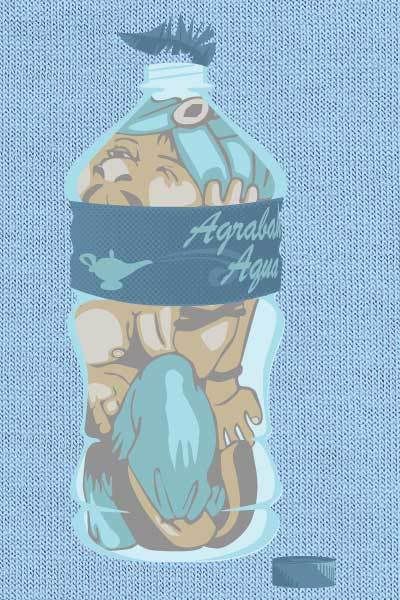
christina aguilera?
nope, not christina aguilera.
but a design that shares a theme with one of her "hit" songs.
the design is sexier than ms. aguilera, and it won't give you a social disease.
submitted to threadless.
but a design that shares a theme with one of her "hit" songs.
the design is sexier than ms. aguilera, and it won't give you a social disease.
submitted to threadless.
Sunday, October 5, 2008
gojirawk.
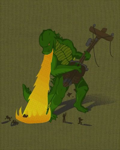
a godzilla (or, "gojira!" as it's stated in the non-dubbed versions) inspired design.
i've submitted it to threadless and had some fun with a flash presentation, click below to see:
Friday, October 3, 2008
hey! i'm on the internets!
in a press release from my employer, nelson&company, i get a ll bashful from the textual pats on the back. you can find these pats here.
no one dislikes public praise less than i do. a monosyllabic verbal approval such as "nice" in person is all i need for my ego. anything beyond that puts me into "aw shucks" mode.
and what's more, this same thing will be in the paper with a picture of me as a reminder i need to get more serious about this diet thing.
yippee?
toolin' about town on tonka trucks.
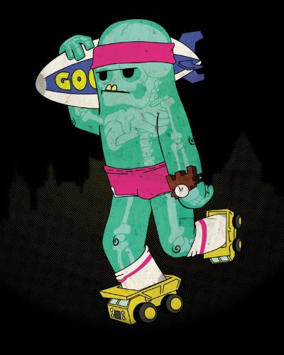
threadless is having a travel inspired design competition. last night, i imagined sliding around on tonka trucks as makeshift skates would be both fun and hilarious, that idea led to this sketch:
which led to this design:
which led to this threadless submission:
which led to colonel mustard in the library with a lead pipe!
which led to this design:
which led to this threadless submission:
which led to colonel mustard in the library with a lead pipe!
Monday, September 29, 2008
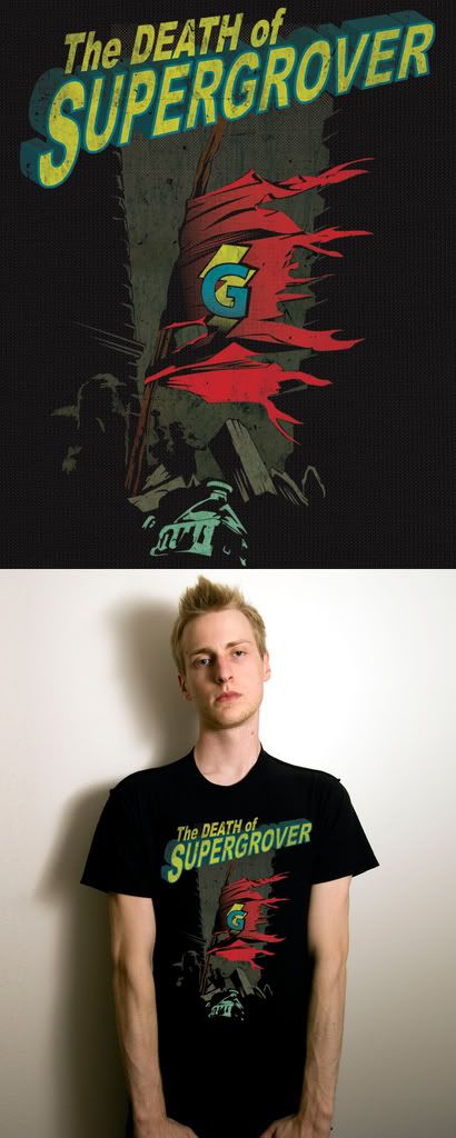
death of a hero.
here is another easy way to showcase my progression as a designer.
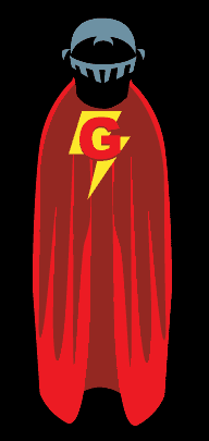
i will start by showing you my old idea and art:
and then, 2 or more years later now, the idea cycled back through my brain. this time i had a better idea for execution and design:
i think i like the new one better.
i will start by showing you my old idea and art:
and then, 2 or more years later now, the idea cycled back through my brain. this time i had a better idea for execution and design:
i think i like the new one better.
Monday, September 22, 2008
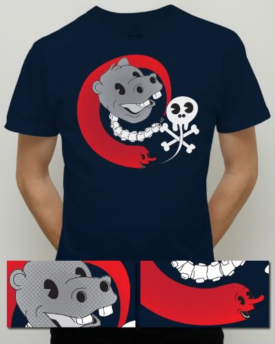
hank the handsome hippo head.
i doodled a bit in the sketch book and came up with something odd, but fun enough an idea that i decided to try and put it on a shirt.
i was running with the classic cartoon design's idea of "everything is anthropomorphic" and mixing it with the stuff that usually runs through my head.
is that scary that my head came up with this?
there are other color options here.
here is the newer version in all it's flash presentation-y goodness. i've fixed up the ears to be more hippo like and mocked up a poster print for the submission as well.
Sunday, September 21, 2008
the big time.
i have achieved another goal in my graphic design career.
any designer can tell you how elated they were to first see their work printed out, brochures, magazine ads etc.
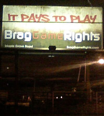
i have seen all the small print possibilities (brochures, store displays, magazines, newsprint) and i've been waiting for my first billboard.
i got close once, but now i've actually reached the goal.
since this is a horrible nighttime camera-phone pic, i guess i should describe the details, the line through the middle is a power line, the background of the board is a concrete wall that darkens to black behind the braggame rights logo, and the logo is actually crisp and clean, but the photo doesn't tell that same tale.
i was the hands on this one, the copy and vision were dictated, but despite the donors, it's still my baby.
there are two billboards, this one is in superior, the other is in duluth and has the line "game on!" (game on was on a list of ideas i had once the single line, logo, location, web address layout was okayed by all parties)
some earlier versions were more ornate and used some of the design elements of the braggame rights' shopping bags.
i'm rambling.
Thursday, September 18, 2008
cube your illusion.
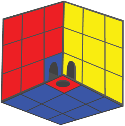
after seeing glennz latest masterpiece, i scoured the web for fun illusions, until i came across a cube with a shifting perspective that I had fun switching back and forth in my mind.
i liked it so much, i went about creating one, and then putting a rubik styled twist on it. then added doorways and a hole to enhance the perspective shifts.
i then spent a decent amount of time putting together a flash presentation for it as a shirt design or a poster print for threadless:
and then i titled it with a cheesy pun / homage(?) to guns 'n' roses... yeah.
Labels:
cube,
dann,
illusion,
matthews,
perspective,
rubik,
rubik's,
threadless,
your
Saturday, September 13, 2008
i loves drawing!
my wife bought me a sketchbook for our anniversary last month, and i've had fun doodling.
it was perfect timing as well, as the threadless loves drawing contest had just started, and it's really put the pencil back in my hand.
i've given up on drawing since i was introduced to photoshop. i also was never amazing at drawing, so it was easy to set aside.
lately i've found the happy middle ground of not caring that others can draw 10,000 times better, there's no point, there are designers that design 10,000 times better, and i haven't quit the adobe creative suite.
here's my last ditch effort to join the threadless loves drawing contest:
a lot of layer effects and the like were tossed in, so the drawing portion is kind of hidden, but i like thqat it's a part of the design and not just the design.
here is a video i put together to detail the creation:
Labels:
argyle,
dann,
drawing,
loves,
matthews,
shield,
sketchbook,
threadless
Monday, September 1, 2008
norris v. transformers
i've had a lazy labor day afternoon awaiting a visit to my parent's place for cheddarwursts and cheesedip.
so i decided to piece this video, transformers starring chuck norris, together for poops and heehaws.
i was very surprised to see the referral videos that come up after the initial video is done, i had no idea that so many transformers fans have envisioned a universe where shape shifting robots and chuck norris lived side by side.
Thursday, August 21, 2008
citizens bank sucks.
my family recently had to purchase a new vehicle after our last one was totaled in a car accident.
we wanted to get the loan through our local credit union, as we're aware that the interest is usually decent due to credit unions being non-profit and all that jazz.
but the dealer we purchased the car through found a better interest rate through citizens bank. normally , when i throw out a name of anyplace, i'll link to them, but this bank seems to have no web presence at all. (unless the name change to charter one is permanent, but they're still mailing out the old citizen's letterhead in an equally moronic move)
strike one.
i received a call last week that our payment was past due, despite having purposefully set the due date to the 26th.
strike two.
we get our money together and call to make a payment, but they only take checks or they can use a check routing number for a one time payment for $12.95.
strike three.
i don't use checks, and i'm getting sick of these companies and corporations trying to save a buck to their bottom line by not paying out the fees necessary to set up credit card and debit card payments online or even simple paperless billing where they keep our numbers on file. (care credit is another notorious company)
so we called back, asked what we owe to date on our as of yet untouched loan, as we will be refinancing through another bank due in whole to their shoddy billing / payment practices. to which the phone rep. stumbles over himself trying to explain that if we refinance the loan this that or the other way, we could save more than the $12.95 a month and make the payments over the phone at our leisure. so, in reality, he told us we are paying too much for our loan, but it could be cheaper and we could pay the same amount. that is weapons grade ignorance.
so i am pleased to say that they just lost a single paying customer to what i can only imagine is a slow growing business (again, i point out that they have no web presence.... mom and pop cookie bakeries have freaking web sites!) and i hope enough people are annoyed with having to write checks in an ever expanding check free market.
citizens bank was built by simpletons.
Sunday, August 17, 2008
a frickin awesome collab.
i have "internet known" a number of people since my parent's hooked up a 28.8 connection in 1997 (and i proceeded to learn html within a month), and one of those people i've gotten to know is evan ferstenfeld. he is better known as frikinawesome at threadless.
he has a lot of fantastic ideas (just look at his slogans) and has had a pretty lucrative side gig collaborating with a number of different threadless designers, and he has had a number of his ideas printed (slogans and collabs)
he showed me a few of his ideas, and this one struck me, so we spent a couple weeks (most of that time accounted for my e-mail server screwing up) putting this together:
once it's up for voting, i'd appreciate your input!
Here's how we made it:
Labels:
bunnies,
dann,
evan,
ferstenfeld,
frickinawesome,
hare,
matthews,
papaprime,
rabbits,
threadless
Thursday, July 31, 2008
gorgeous george.
a new threadless design.
i am also currently submitting designs to teefury.com. they have a shirt.woot kind of set up, where there's a new shirt every day, only unlike shirt.woot, you can't buy it after the 24 hours is up, and there's no contest element to it. which i kind of like. although i love threadless to death, the voters there are primarily comprised of teenagers with their mouse hovering over a vote of zero. it's nice to be able to enter somewhere the staff of design minded people just pick whatever tickles their fancy.
Wednesday, July 30, 2008
jobhunt over, i killed a job!
after an interview for some freelance work with nelson&company the interviewees spoke of plans to hire a designer full-time somewhere down the line.
the very next day they called me to come in and interview for the very position that sounded like a pipe dream the day before.
had that second interview yesterday and received the job offer 12 hours later.
i have one interview to finish up at h.t.klatzky tomorrow afternoon. but all signs point to me reporting to nelson&company monday morning.
i am extremely relieved to be employed again. as i've stated repeatedly in these blogs, this was the first lapse in employment i've had since i was 16. so the malaise and discontent can finally subside.
i never thought my psyche would rely so heavily on being employed. the diminished funds never became a big issue, it's just not feeling accomplished that has been driving me insane.
Labels:
dann,
employed,
employment,
ht klatzky,
job,
matthews,
nelson and company,
unemployed
Friday, July 18, 2008
job hunt = not so great.
well, i have been unemployed for over a month now. again, this is the first time i've had a lapse in employment since i was 16 (when i moved to minnesota from alaska).
i found that i had a decent network of friends who work in the graphic design industry, or at least close to it; so that was positive. i've been trying my hardest to stay in the duluth/superior area, as we have a mortgage on a place and a lot of family around here, but the positions just don't exist.
i have 2 meetings coming up, one with nelson & co. they usually farm out their graphic needs, so that would be a freelance gig at best for now. the other with ht klatzky. they're not currently hiring, but they were interested enough to sit down with me and go over my portfolio, so that is incredibly cool on their part. especially if i end up with a bad gig somewhere to get the bills paid, that'd be a nice callback in the future. i'm also trying to get my foot in the door at westmoreland flint. i missed an opportunity for a gig in their fargo offices, and i have a few names to drop currently in their employ at their duluth offices, so fingers crossed all around.
i have also sprinkled my résumé and references all over town periodically throughout the weeks, becoming less and less surprised by this conversation:
"hello, company x."
"hello, i was wondering if you are currently hiring for any graphic or interactive designer positions?"
"no."
"that's too bad. i was wondering if there was anyone i might be able to leave my résumé and references with in case you may hire in the future?"
"we're not hiring." *click*
at least i'm fully aware that it's a dead end, but it took a few calls to get used to that dialog. thy must be getting a lot of requests right around now.
i begin my big expansive search next week. i was trying to avoid moving, but if no can employ me here, i have to move to where they are hiring i guess.
i'm not a big fan of uncertainty.

Monday, July 7, 2008
turkey derby.
i have 2 new submissions at threadless.
the first, is a "sequel" to my printed design at threadless. a large group of threadless printed designers made "sequels" to one of their printed designs. below are links to the original and the sequel:
i have also photoshop frankensteined together a turkey in the classic traditional kindergarten art project, titled "gobble."
the first, is a "sequel" to my printed design at threadless. a large group of threadless printed designers made "sequels" to one of their printed designs. below are links to the original and the sequel:
i have also photoshop frankensteined together a turkey in the classic traditional kindergarten art project, titled "gobble."
Wednesday, July 2, 2008
crashes, beer & graphic design.
it's been a hectic 2 weeks.
6 days after being laid off, an suv tried to force a subaru outback into the trunk of our car.
the outback didn't fit.
all in all, we were car 3 in a 5 car pileup. everyone is safe with minor aches and pain. the car was totaled and we were 3 months or so away from owning it outright.
the day after this debacle, we took a roadtrip to montana for a family reunion slash job hunt. and despite beer being the secondary promise in the blog title, my family was a little more conservative this year (and i don't drink, so i was the perfect man to document)
here is the trip in a musical format:
and, in the ever widening pantheon of online design contests, i was invited to another t-shirt design community the other day. itself has a very similar set up to threadless, in that it's an ongoing competition (new shirts every 2 weeks to threadless' every week), a voting period (60 days to threadless' 7 days), and there are a lot of the threadess alumni (including me) there.
i have two designs up for voting there right now. both can be found here.
i was glad to get to update "aquanet lincoln" who has seen a lot of design competitions, but this is an updated version, now titled "awesome abe."
i also entered "multinational." for the first time in a t-shirt competition.
well, i'm off to litter the town of duluth with my résumé.
Friday, June 13, 2008
i am a free agent.
my employer had a rough year and had to go through some restructuring.
the company is focusing on production with print on the side.
they are eliminating the web production.
i do print and web.
my coworker does print and production.
i was let go.
i'm a little embarrassed that my pink slip is showing. this is the first lapse in employment i've had since i was 16
so i'm a free agent, awaiting the next graphic design gig i might wrangle.
if you may be an interested party, i have provided my online résumé here.
and you can find samples of my work on both my website, and the more compiled online portfolio.
Tuesday, June 3, 2008
my little four year old photographer
my daughter, araia lynn, loves to sneak away with my wife's cell phone and take pictures.
my wife and i were surprised at how interesting a lot of the photos turned out:
seeing kids pics just make you happy, because the only bias you can read into is love or curiosity.
my wife and i were surprised at how interesting a lot of the photos turned out:
seeing kids pics just make you happy, because the only bias you can read into is love or curiosity.
Monday, June 2, 2008
ten dollar tees!
threadless just began another annual summer sale, with shirts as low as ten smackers.
this is a perfect time to nab my winning design:
*please note that my shirt is twelve dollars, not ten
Wednesday, May 28, 2008
typography vs. dann.
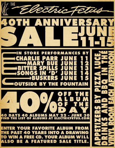
i was handed a challenge at work yesterday. i had to come up with a quick flyer for a local music (etc.) store, electric fetus.
i had to translate 3 paragraphs worth of copy into an 8.5x11 handout.
i will file this as my first well made typographical project.
i usually battle typography, but i was able to turn all the text into a design.
i'm not used to tooting my own horn and i apologize, i hope you enjoyed my toot.
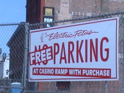
to keep the tootin' common (tutankhamen... king tut.... i am hilarious) here's a sign i had made for them earlier this year:
Labels:
dann,
design,
duluth,
electric,
electric fetus,
fetus,
matthews,
minnesota,
mn,
typography
Tuesday, May 27, 2008
high priest of additive light.
i have another threadless submission awaiting approval right now.
if you're cheeky enough, you find the misspelling and mock me furiously over it.
and to explain the name, i will place my professor glasses precariously on the bridge of my nose and we shall begin:
additive light:
this portion of the title is referencing additive color. additive color is how the eye perceives color from computer monitors, television, etc. when all the colors are shown at their strongest, you get white. where the opposite, subtractive color, when all the colors are at their strongest you get black. this is how color is perceived in print media, or more easily remembered through sloshing all your finger paint colors together in preschool when you got that brown/black muddy color.
the rest is kind of obvious, the six arms like that of ganesha the hindu god blah blah blah.
Monday, May 19, 2008
new threadless print.
the title is misleading, as this is my first threadless print.
a design i had made back in december, was purchased by threadless.
the actual print is a little smaller, as i'm certain they had to scale it to fit girls extra small as well as 3xlarge, but i still think it looks dynamite.
if you're so inclined, you can buy the shirt here.
i was introduced to threadless and started submitting designs a mere month before i began schooling for graphic design, so there's a definite arc in the quality of my work (that i'm nowhere near the end of), and it's really vilifying that the designing playground that i got my start at finally liked one of my designs enough to nab it.
i promised myself i wouldn't cry.....
if you're tired of reading my attempts at wit here, threadless also conducted an e-mail interview with me where my charm continues to fool no one.
Friday, May 16, 2008
i have a thing for hats.
i have a new threadless submission, and i'm stoked because this is the first one i've submitted with a flash interface, check it out by clicking below
i know of a few dial-up voters who simply vote zero on anything that takes more than a second to load, but they tend to be the same type to score a zero regardless.
i have a thing for hats.
i think it stems from my head being too large for most of them that draws me to them.
i know of a few dial-up voters who simply vote zero on anything that takes more than a second to load, but they tend to be the same type to score a zero regardless.
i have a thing for hats.
i think it stems from my head being too large for most of them that draws me to them.
Subscribe to:
Posts (Atom)